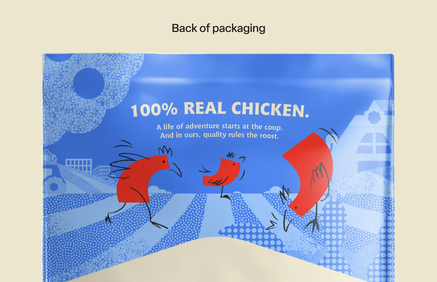
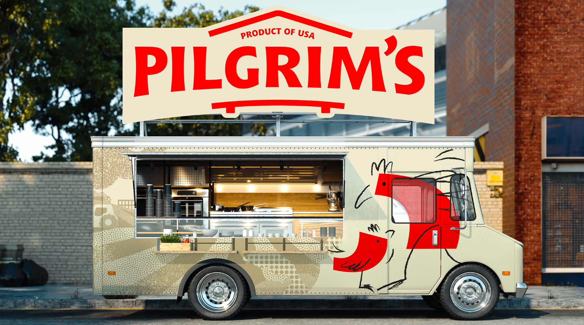
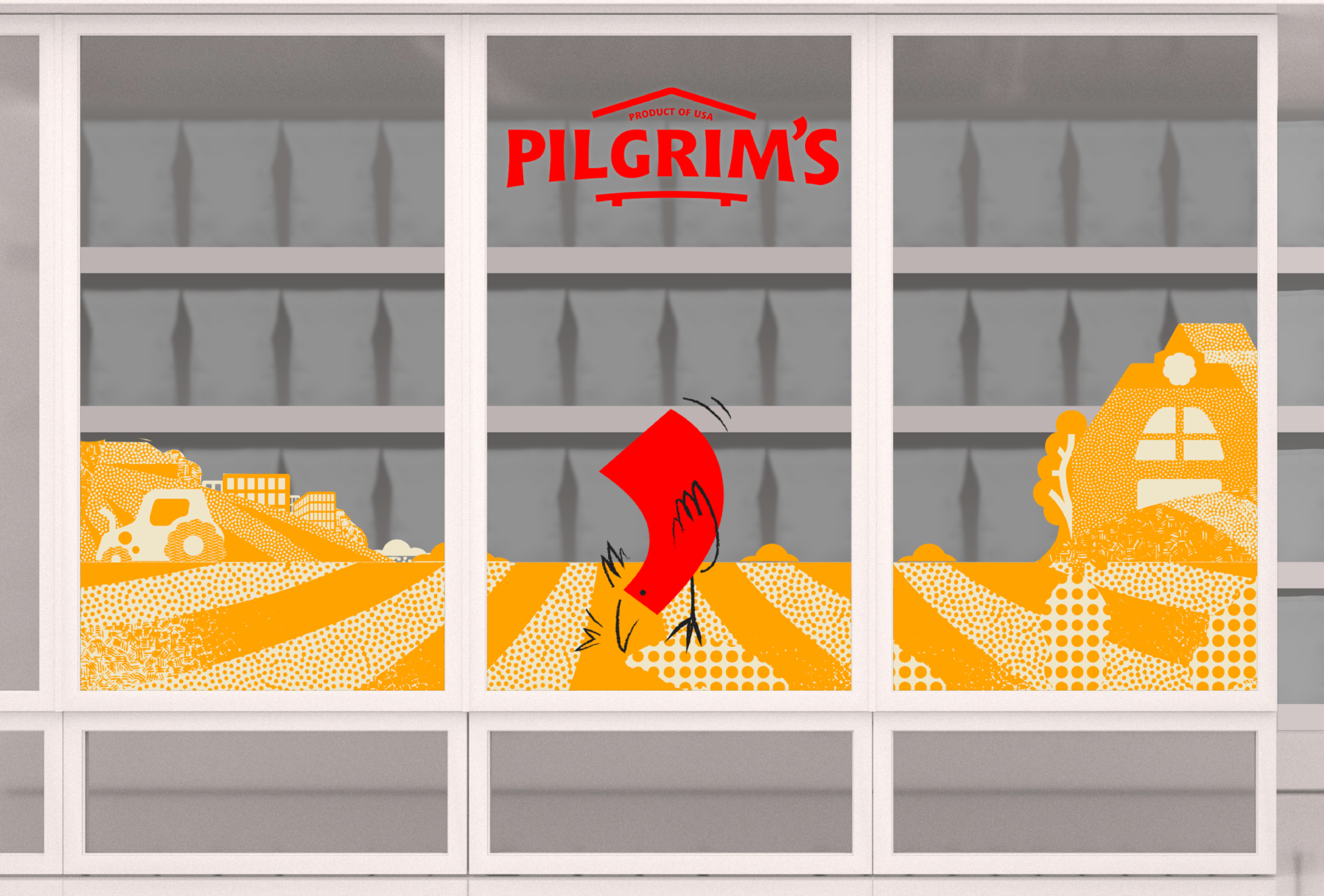
During my time at JKR, I joined the design team in the early concept stages for the rebrand of Pilgrim’s, a frozen chicken nuggets brand based in the United States. My main involvement in the process was conceptualising and designing the mascot, as well as illustrating other assets for packaging and social media. My contributions ultimately helped define the creative direction of one of the main routes of the project, which received positive feedback from the client.
APOSTROPHE EXPLORATION
Designing the mascot
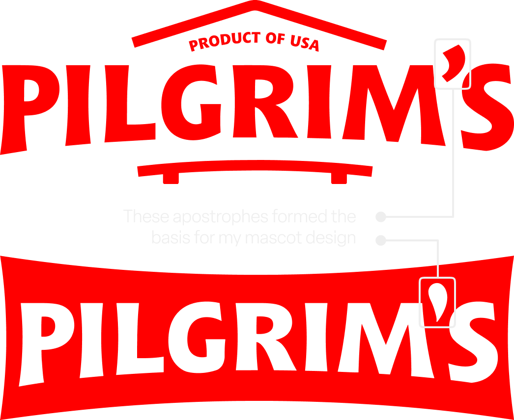
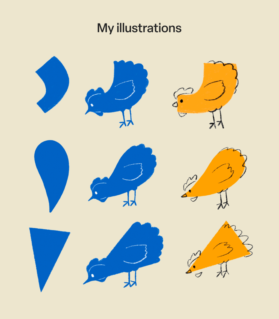
When exploring designs for the Pilgrim’s mascot, one of my main ideas was to use the apostrophe from the brand's typographic logos as the body of a chicken mascot, and hand-drawn lines to bring its features to life. I drew these on Procreate.
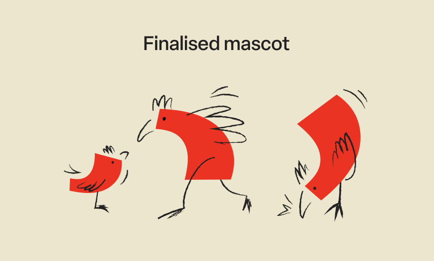
My sketches and illustrations were translated into fun characters who interact with each other by the illustrators in my team.
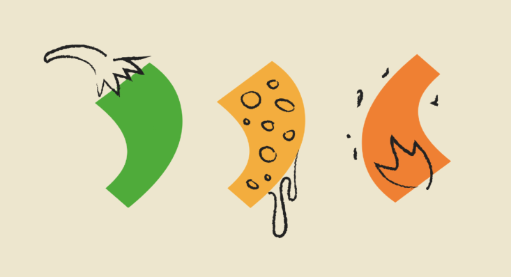
Flavour exploration
I also illustrated Pilgrim’s three main flavours (jalapeño, cheesy, and spicy) in the apostrophe format to stretch this asset even further, although it was adopted only for the mascot design.
Ultimately, my mascot illustrations formed a key part of the brand concept and a hero asset that was applied across many touchpoints.
other illustrations
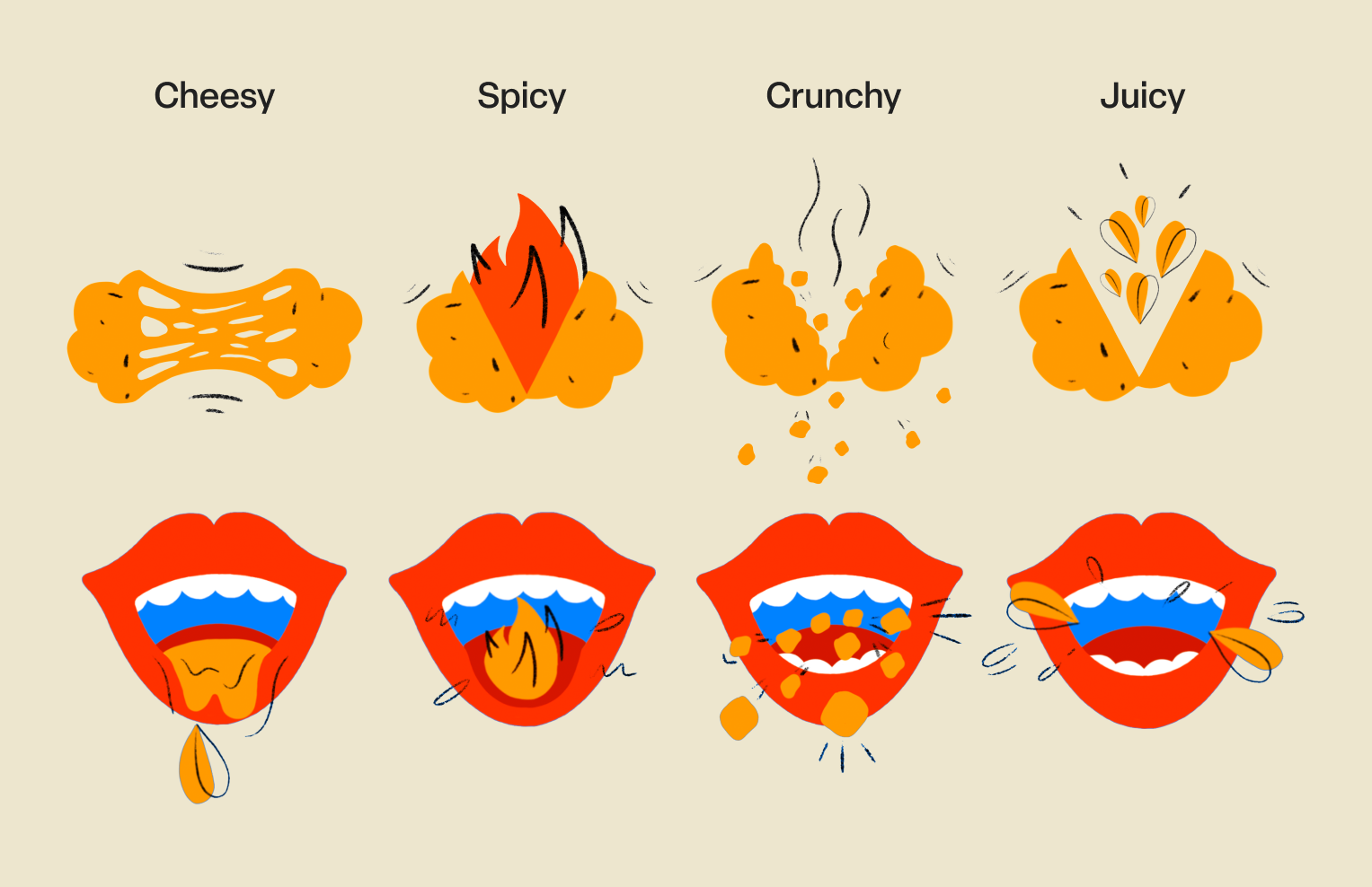
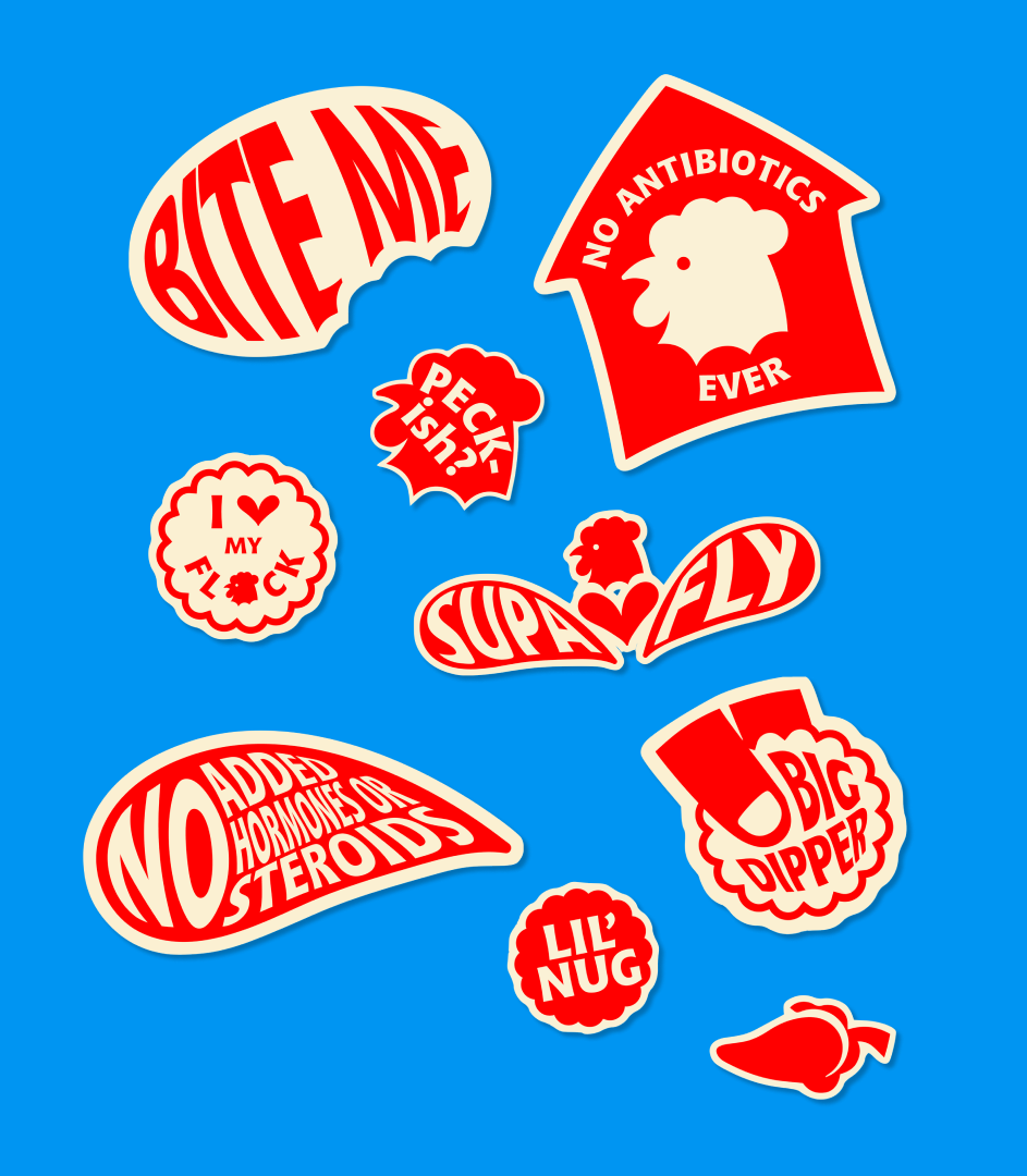
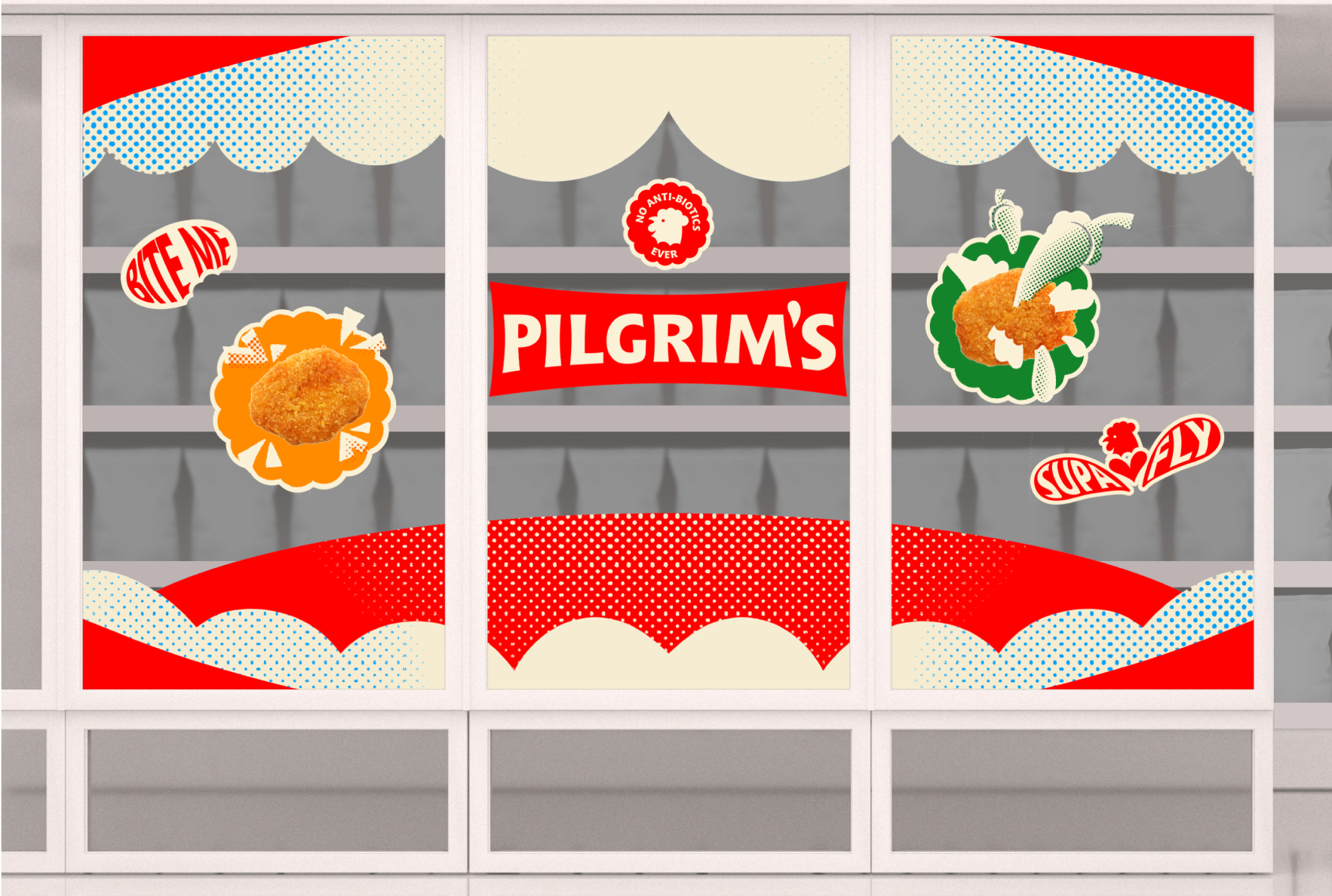
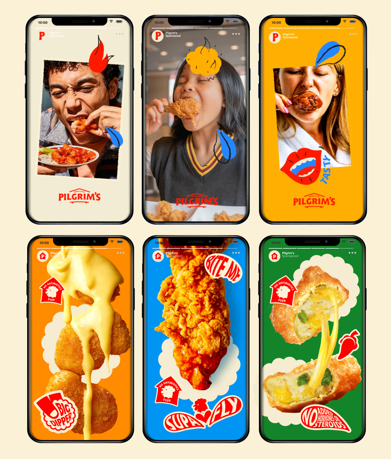
I experimented further with the block colour 2D shapes and hand-drawn sketch illustration style, bringing to life the vibrant flavour and texture qualities of Pilgrim's chicken. I also illustrated ideas for stickers based on the tongue-in-cheek copy lines and essential product claims to be utilised on various platforms, like social media.